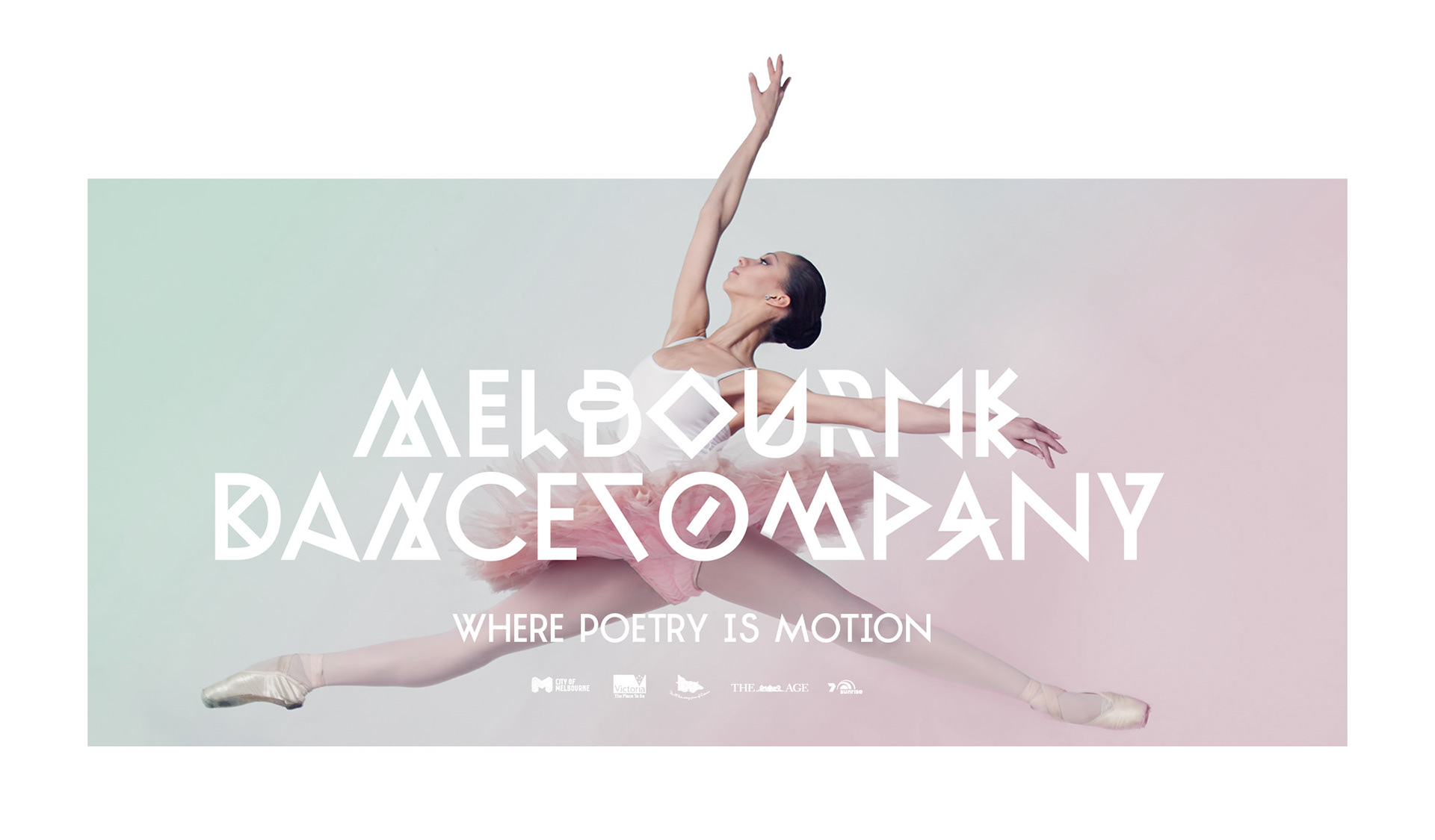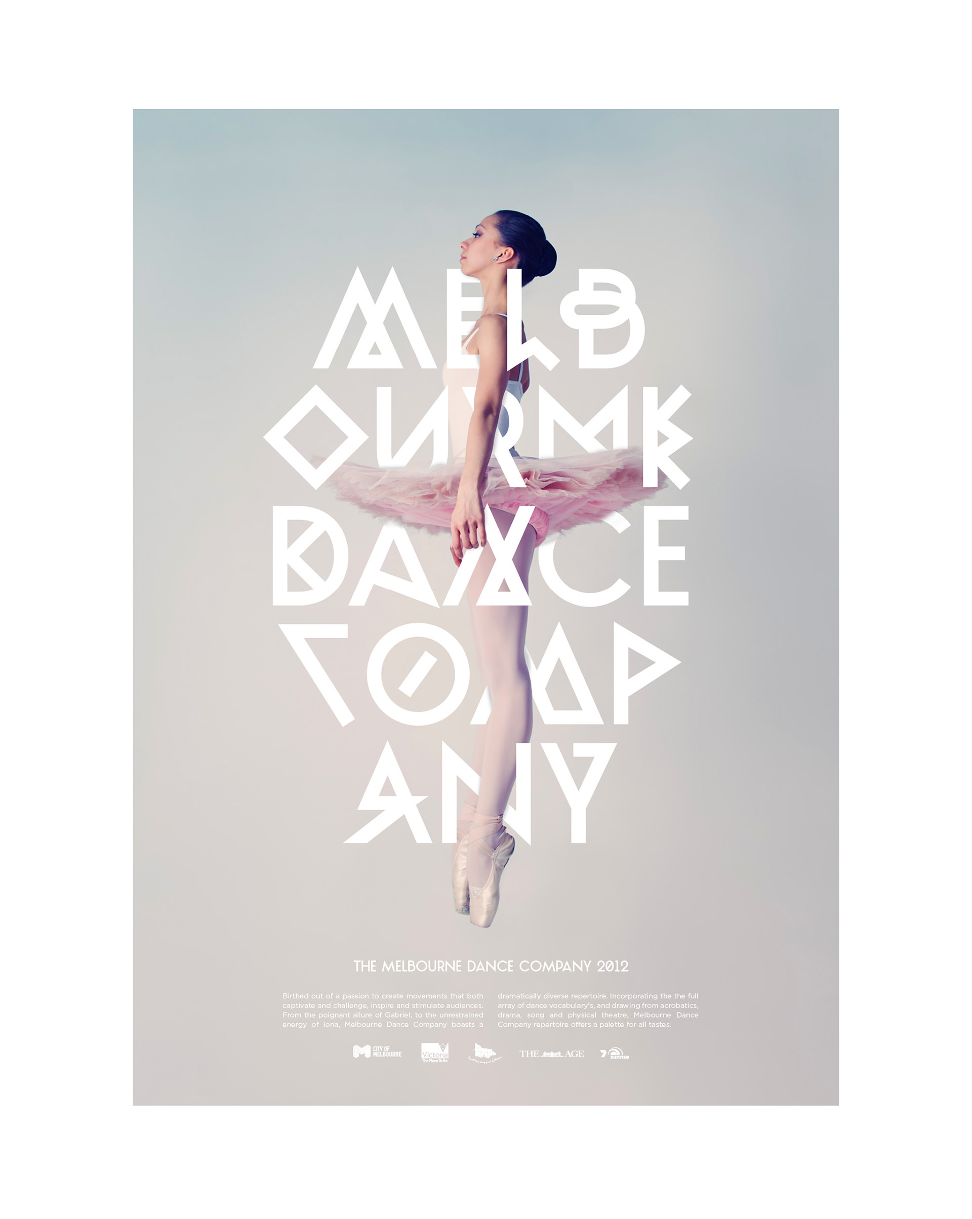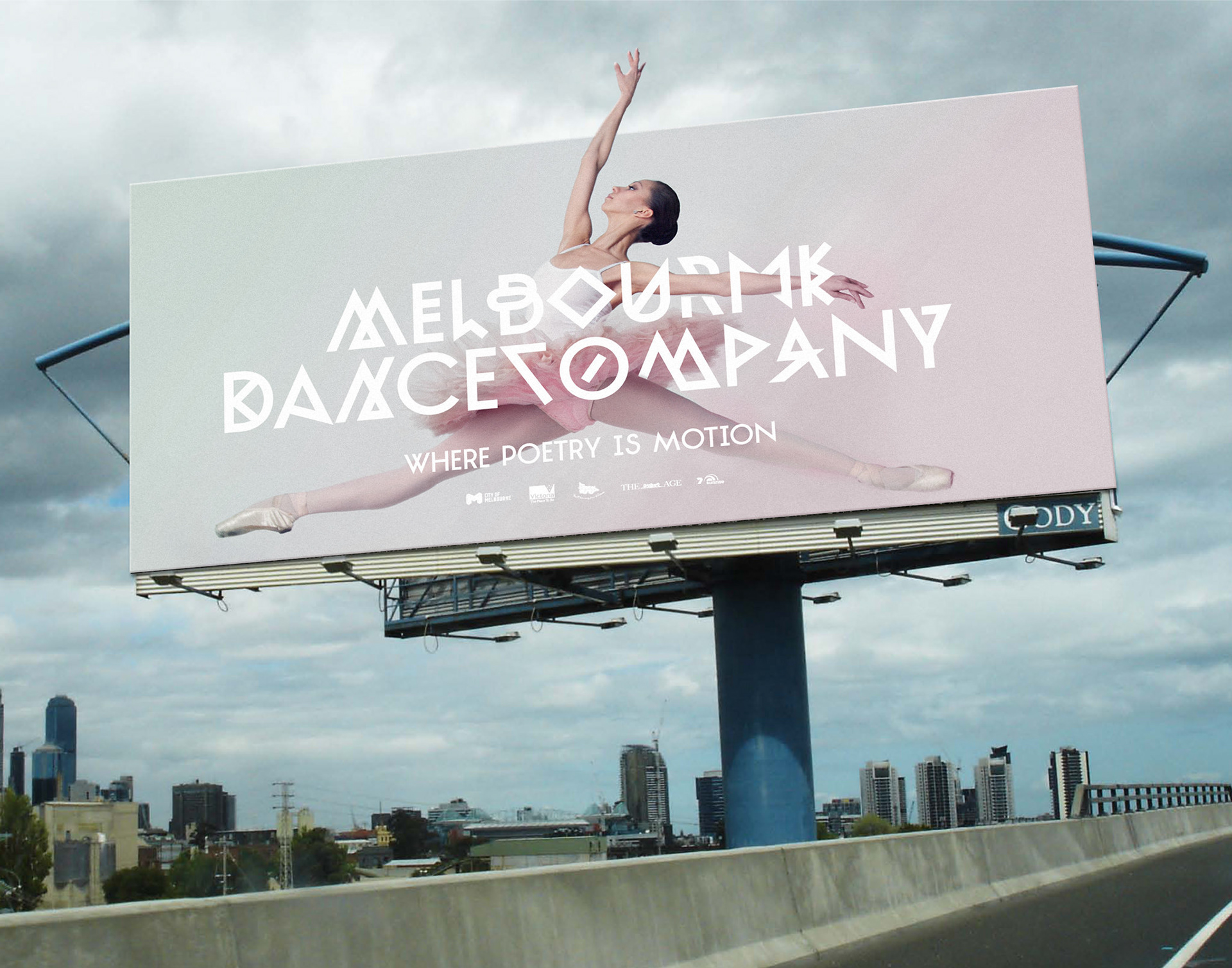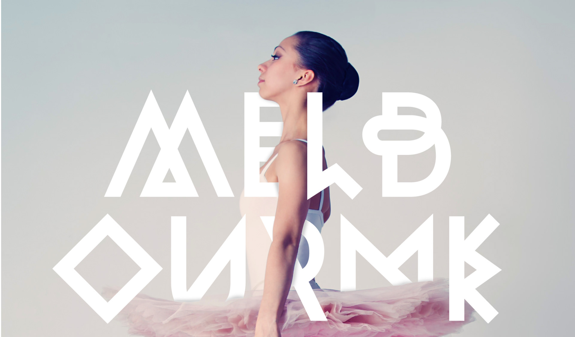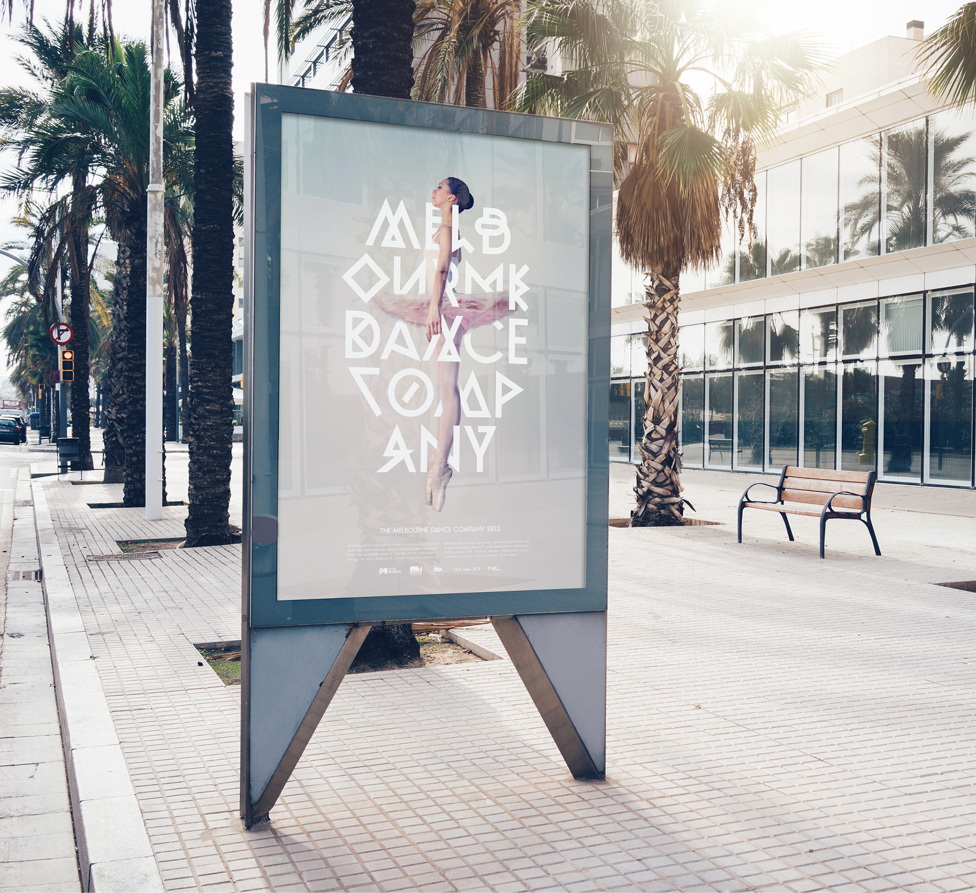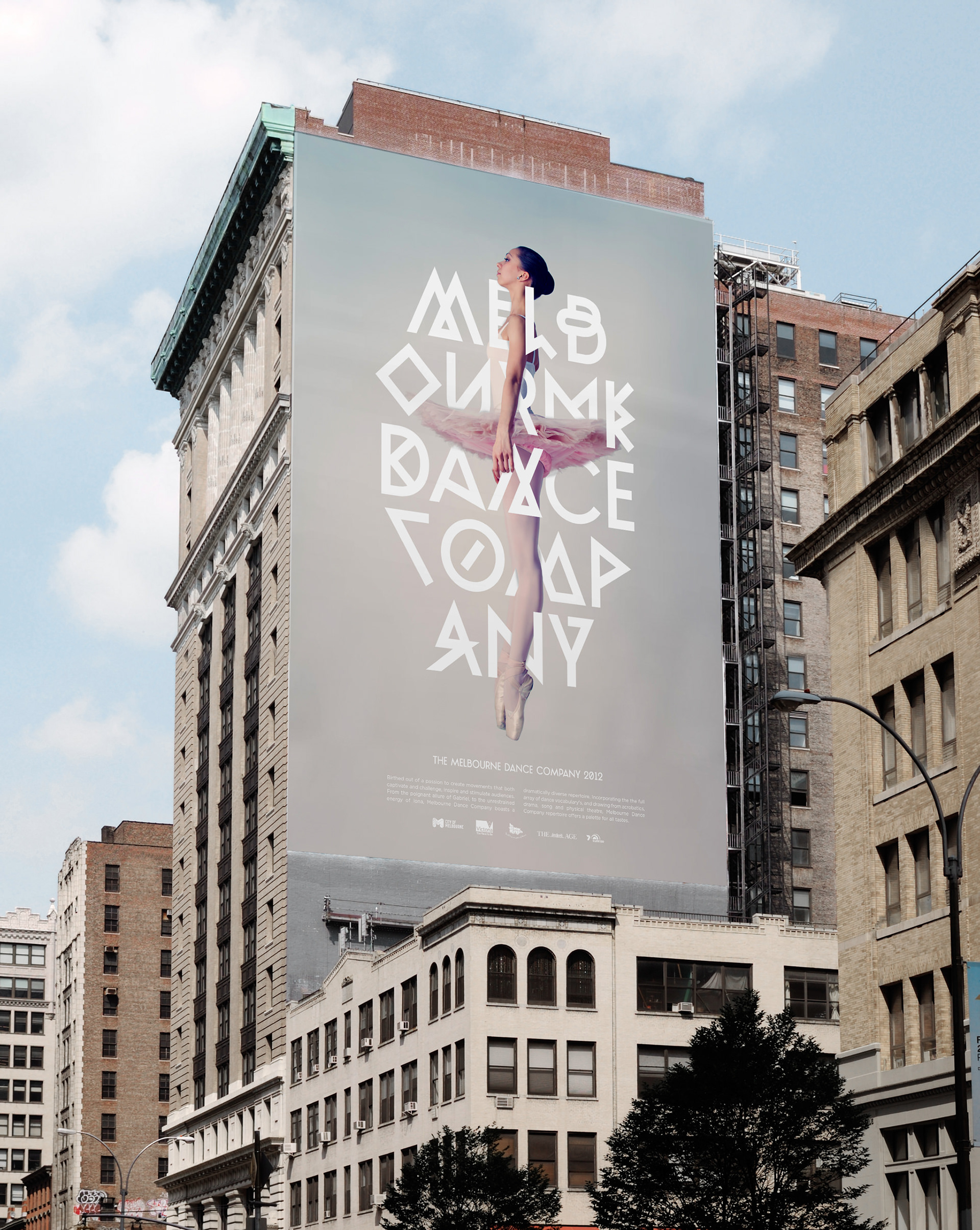
Melbourne Dance Company
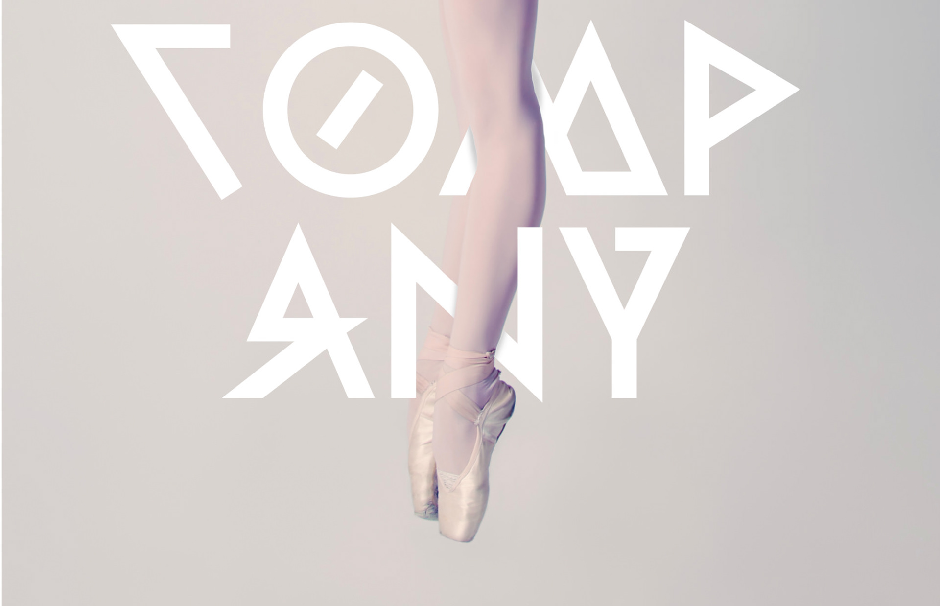
Brand IdentityWhen I was first approached to design the poster for the new Melbourne Dance Company, I wanted to do it a little differently. It felt cliche to use a script type, as it was used like that countless times for ballet posters.
Initially the design was just going to be used as a headline but I had to remember that dance was an expression of movement, thus, I wanted the type to wrap around the dancer as if it was dancing on it’s own. And because the type has such sharp corners, and ballet is meant to be quite sensual, I purposely wanted this contrast in the juxtaposition.
I wanted the viewer to look at the poster and let it play in their mind, both with the harshness of the type and the softness of the dancer. Just like dancing can be interpretive differently to others, I wanted to do the same for the poster. Using the different characters within the type allowed me to do this, and overall, create a visual dance in itself.